ABOUT THE PROJECT
Designing luxury retail for the future
A new store concept for Harvey Nichols broke the rules and challenged the predictable and established principles of luxury retail.


CHALLENGE
Yes, luxury retail is renowned for high-end design, but it is also a category rife with cliché.
As Harvey Nichols embarked on a global reinvigoration of their store concept, it was keen to avoid the usual department store tropes and stay true to their brand values of being witty and fun.
THE OUTCOME
Eschewing typical design
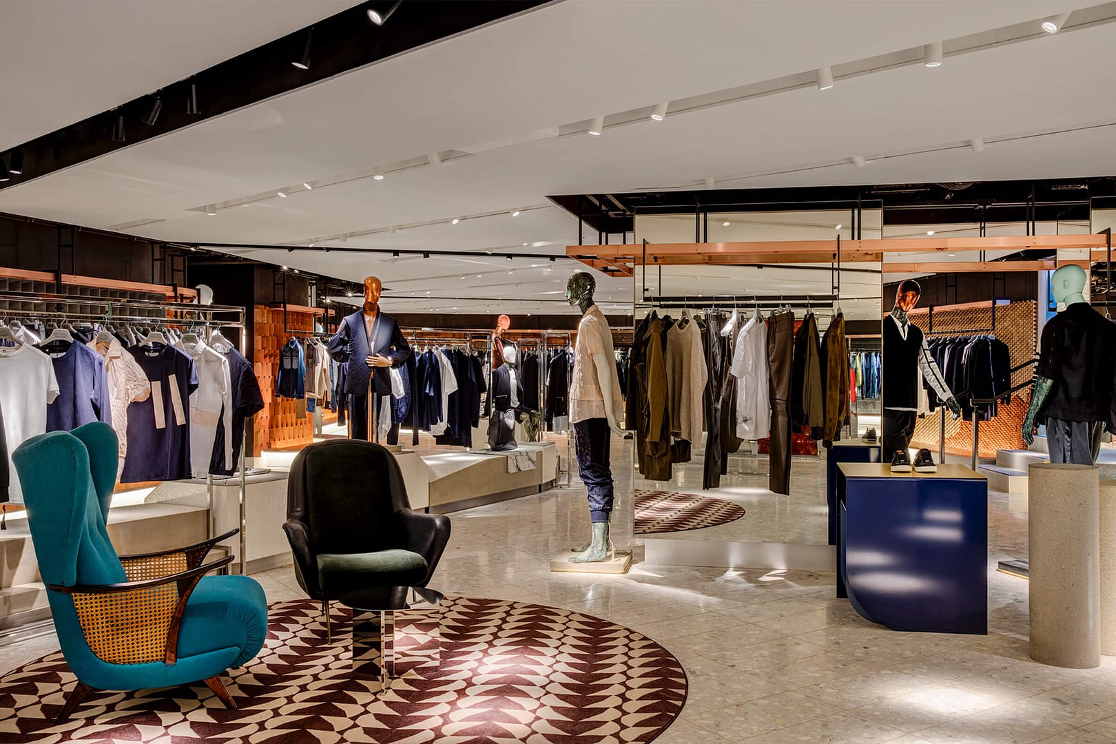
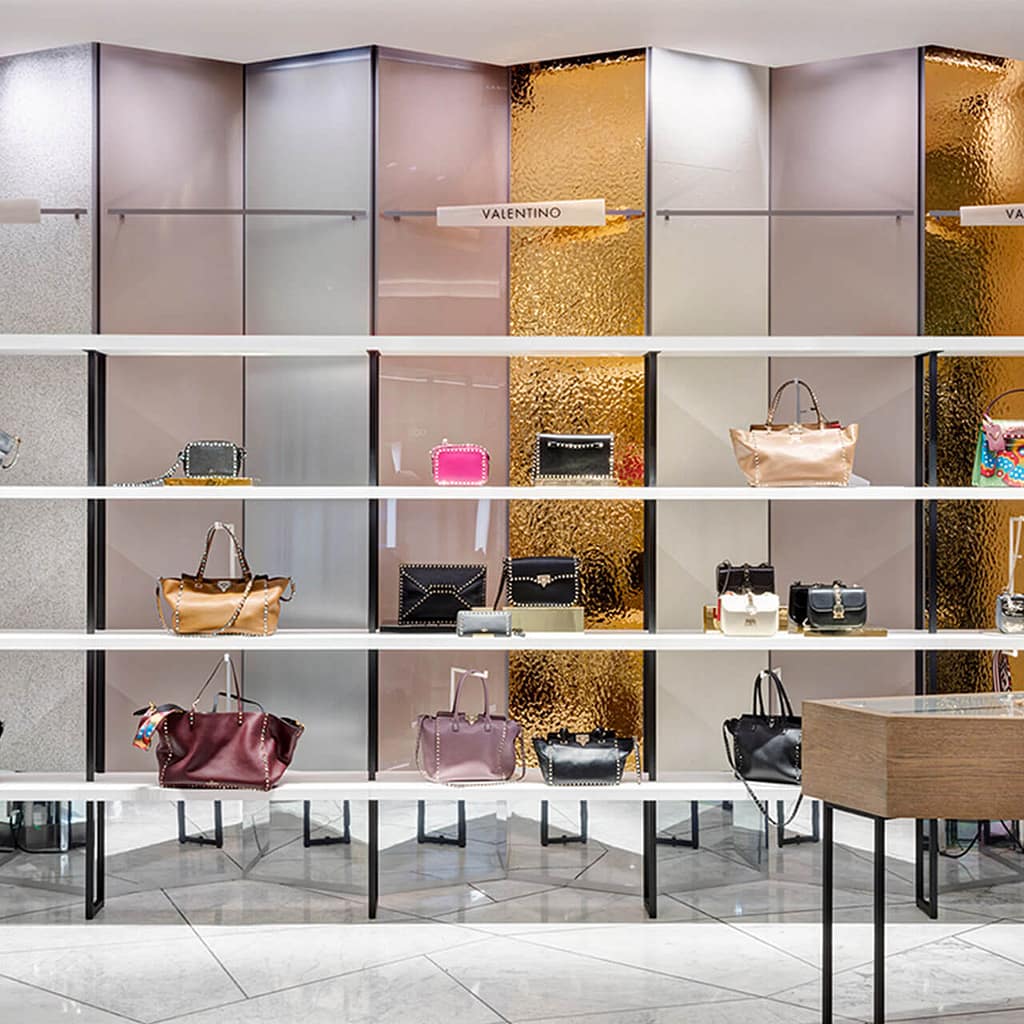
For the Harvey Nichols audience, luxury is not defined by brands themselves, but instead by the curated lifestyle they help to create. We knew that the new store concept would have to be designed around these customers rather than branded concessions.
Controlled disruption
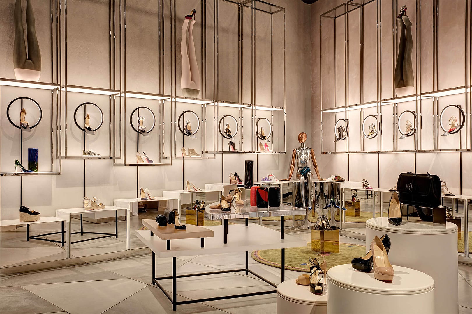
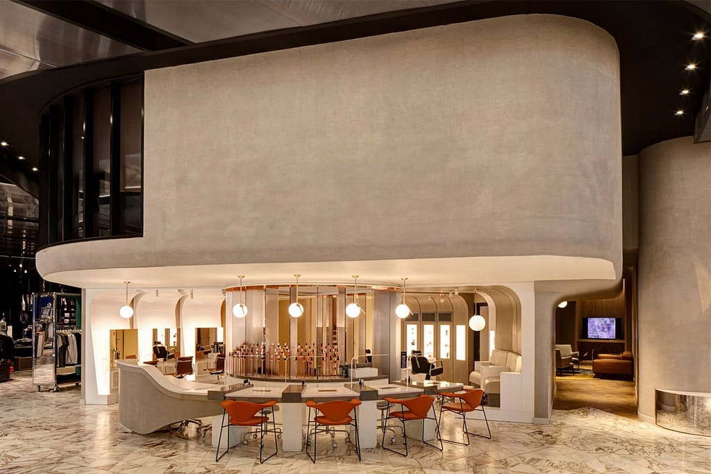
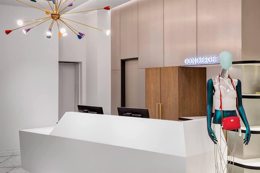
Our guiding principle was the idea of ‘controlled disruption’ and that helped us to craft a truly unusual store layout. The disparity and eclectic approach to materiality, the contrast between rough and smooth surfaces, and the variety and quirkiness of the furniture created a very unusual, almost subversive design vocabulary.
AWARDS
Retail Week Awards:
Store of the Year
There are no branded concessions and cleverly there is no walkway, encouraging customers to meander between brands.
Design Week
The experiential aspect to the store is now a focus for Harvey Nichols when it comes to bricks and mortar.
The Drum
VALUE
For the audience
A significant departure from the typical ‘shop within shop’ approach taken by most department stores today, Harvey Nichols customers were able to browse the department store in a way that felt truly unique and curated.
For the brand
The generic approach to branding, with no concessions, reinforced Harvey Nichols’s iconic status beyond labels. The project won a prestigious Store of the Year Award at the Retail Week Awards.
